Welcome to another edition of Top Ten Tuesday (hosted by That Artsy Reader Girl)! Today’s topic is supposed to be “Cover Redesigns I Loved/Hated,” but to be honest, I can’t even think of ten cover redesigns, so we’re just going to list a few cover redesigns and then talk about covers that I love or hate. So here we go!
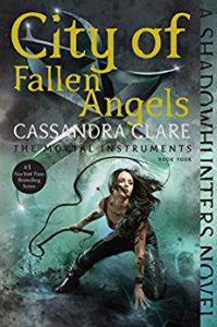
I do like the redesigned covers for The Mortal Instruments better than I like the original covers (although I really like the original cover to The Shadowhunter’s Codex). The first ones weren’t really all that pleasing to me.
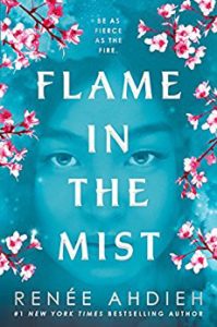
I like the new cover to Flame in the Mist better than the original as well. I think the colors are more aesthetically pleasing, and I’m not sure what the bird from the original cover has to do with the story.
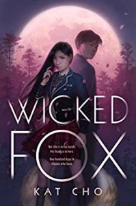
I love the cover to Wicked Fox! It hasn’t been redesigned or anything, but it was the cover that drew me into this book to begin with. The title was just okay for me, but once I saw this cover, I knew I had to read it!
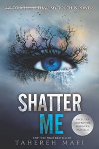
I’m probably alone here, but I think the Shatter Me covers are creepy. I’m not a big fan of the eyes. Sorry. I wouldn’t mind a redesign of these covers with something other than eyes.

They redesigned the American Panda cover for paperback… and I’m just not feeling it. I like the original hardback cover pictured here. I like the model’s angle with her holding the frothy beverage… it makes me think of winter, so maybe that’s why they redid it, but I like this one better.
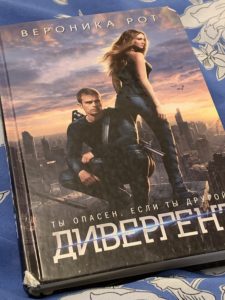
I’m not a big fan of the Divergent movie tie-in covers either. I prefer the original covers with the flame.
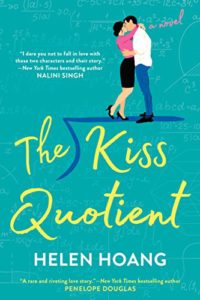
I guess I’m talking about redesigns more than I thought I would today. I really like the original US version of The Kiss Quotient. I don’t really care for the UK cover with the heart. “You had me at math” was why I decided to give this book a try, and the whole division sign on the front added to my love for this cover.
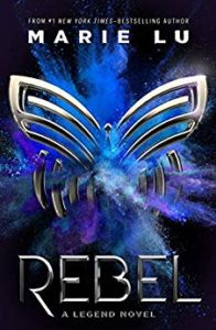
I really like the cover to Rebel with the butterfly and the riot of chalk dust. I don’t know how I’d feel if they re-designed the original trilogy to match this one, but this one is nice the way it is.
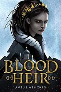
There is a redesigned cover for Blood Heir going around, and I’m not sure if they’re planning on using the original cover (pictured here) or the other cover, but I prefer this cover. The publishers and author decided to push back the release date after there was a little bit of controversy, but I don’t see why it would have warranted a new cover, IMO.
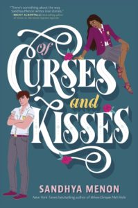
I love the cover for Of Curses and Kisses as well. It’s a little hard to see at this size, but I absolutely love the detail on Jaya’s shoes and the detail in the lettering. This is supposed to be a trilogy so I’m looking forward to three of these adorable illustrated covers!
So that’s my Top Ten Tuesday about book covers! What covers do you love or hate? I’m looking forward to seeing what everybody else has to say!
I’ve seen Shatter Me on several lists today. The redesigns are very striking! Here is my Top Ten Tuesday.
Although most people seem to like them so I guess I’m an outlier.
I’m not a big fan of movie tie-in book covers either. The problem with them is how quickly they can feel dated. I’d rather have a cover that doesn’t feel super 2019 (or whatever year it was published in).
My TTT.
Lydia recently posted…Put Down Your Phone and Pay Attention
Although I think all covers will get dated at some point anyway. Book trends come and go. But the movie characters aren’t necessarily the same vision I have for the characters.
I didn’t even realize there was a cover redesign for The Blood Heir. I’m anxiously waiting for that one to come out.
Leelynn @ Sometimes Leelynn Reads recently posted…Top Ten Tuesday: Cover Redesigns I Loved/Hated
I hope you like it. I was able to read the older version (I was approved for the ARC the day before they pulled it) and I thought it was really good. I’m sure edits will make it even better!
I really like the Wicked Fox cover. It’s so unique.
I just couldn’t resist reading it after seeing the cover!
I’m not a fan of movie tie in covers either, but The Fault in Our Stars is the only exception. I really like seeing Hazel and Augustus on the cover.
I hope they don’t change the cover for Blood Heir, too. It’s actually pretty cool as is.
I’ll have to take a look at the TFIOS covers! The first one is a little plain, so I can see how the movie tie-in might be an improvement.
I think the Cassandra Clare redesigns are nice. Wicked Fox definitely has a nice cover, and I like Rebel too.
Greg recently posted…Tuesday Tagline #152
The matching spines in the boxed sets are pretty cool too!
I’m not a huge fan either of the Shatter Me covers, but I think they are better than the original one. I agree with you on Flame of the Mist, I do enjoy this one so much more.
I forgot that I had seen the original Shatter Me cover before this week. That one’s kinda “meh” to me as well. I know the cover people can do better!
I actually agree with Shatter Me. Back when it was first redesigned, I really liked it (it was so much better than the original), but now I’m not really a fan. It really is a bit creepy. Have you seen the Imagine Me cover? It’s…strange
Yeah. Looking at an enlarged copy of the cover on Goodreads kinda grosses me out. I just think of what it would take for someone to put all that stuff on your eye and… I get the heebie jeebies. I wear contacts so I have no problem with sticking a finger in my eye, but… maybe it’s because I almost never wear eye makeup so I can’t really picture putting stuff around my eyes like that.
How cute is Curses and Kisses! I need to see this cover properly!
I have a much larger photo of it (where you can see many of the yummy details) here: http://www.brookereviewsnsweeps.com/2019/07/of-curses-and-kisses-cover-reveal/
What I hate is when a publisher changes the cover before a series is complete, making it impossible to complete a set without it looking wonky. Thanks for visiting my blog.
You’re welcome! I agree with you about changing midway!
Agreed with so many of these! I really am fond of that cover for Of Curses and Kisses. I’m such a fan of illustrated covers. The colouring on that one is gorgeous and I MUST have it. (Insert bizarre cackling here.) But in all sincerity great picks!
Thank you! They make so many beautiful covers these days.
Ooo! SO MANY pretties! I like the new ‘Curses’ cover. It’s so cute, and the colors are on point. I did see the “American Panda” re-design at B&N about a month ago, but must confess I have forgotten what it looks like by now. 😀 Thanks so much for visiting Finding Wonderland last week.
Rissi JC recently posted…The Greatest Showman – A Romance With ‘Stars’ in its Eyes
Happy to visit! I’m glad you liked these covers.